Geologic mapping can span many scales of time and space. Some of the most complex linework can result from evaluating a fluvial system in great detail in a small area and over a geologically instantaneous period of time. In my case, this scenario corresponds to the Bill Williams River in Arizona. For several years, I have been compiling detailed geologic maps of channel change on that river since 1953. The result? A heaping plate of GeoSpaghetti.
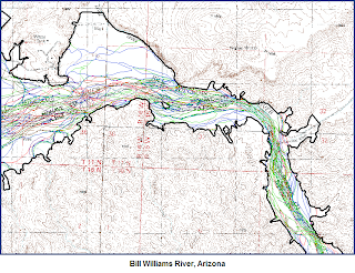
The image above is an excerpt from a 35 mile stretch of river. Yes. The river has undergone some profound changes in the last 50 years or so. Exactly how and why is beyond the point of this blog. One day I will publish it if it matters to you.
The point of this entry is to describe the various tools and methods that I have employed in ArcGIS to compile the lines in a meaningful way and to turn the resulting spaghetti into a meaningful map or series of maps.
The Project:
Map the bottomland geomorphology of the Bill Williams River at specific points in time using a chronology of orthorectified aerial photographs. At this point, I have mapped six generations of the valley bottom. The resulting plexus of lines is a logistical nightmare to a certain extent, but I believe I came up with a reasonable way to deal with them. If you map similar things and have better ideas or suggestions, please let me know.
- Set up a geodatabase...yes you need to know the basics of this fundamental operation. Add your lines as classes in a geology feature dataset.
- Determine a boundary to which you will be mapping and stick with it. Note that as you map different generations of lines, you will want to alter the boundary...you just will. However, unless it is a major issue and you will diligently propagate that alteration through all of your line layers, resist the temptation
- Develop a line and polygon attribution scheme that is flexible and systematic. Important: this scheme needs to be logical and transferable to each generation of linework. Certain generations may require specific types of lines and polygons, but try to adhere to a common conceptual base so that it makes sense all the way through. Record the nomenclature in a spreadsheet and update it when you inevitably revise or add to your units. The spreadsheet can be a life-saver if you tend to work on too many projects and put this one down for a few months.
- Begin mapping the earliest generation of photograph if possible. It is best to map the images in chronological order for reasons that will soon become clear. Map lines NOT polygons. Starting with polygons is whacked. You can build them from lines in a matter of seconds.
- Once the earliest generation is mapped (and you have attributed the ‘proto’ polygons with a point feature class...post coming if this is news to you) and the topology is all correct (you did build and check the topology, right?) copy it and rename it. Use this dataset as a starting point for the next generation of photos. Note: the tediousness is about to set in or get worse.
- Yikes. Your map is already a mess. Now you need to mesh the data in a logical way. You have added lines that preclude the existence of some of the previous generation’s lines, right? All of the precluded lines need to be removed (don't worry the originals still exist...remember, you copied them).
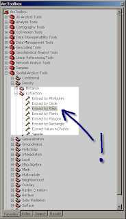
- Luckily, you have already built and analyzed the topology of your first layer, right? Well now build and analyze the topology of the second layer for laughs. The only rule you really need is the ‘no dangles’ rule. If you have the topology built and analyzed, you can use the ‘Planarize’ tool to break selected lines (even all of them) at each intersection. Then you can sweep through and select and delete all of the (now) superfluous lines.

That sounds easy right? It is easy, but really really tedious. Also, unless you have taken some preliminary precautions, you may lose all of your careful attribution. For better or worse, when you set up the geodatabase, you have many, many, options to ignore or address. Some of these are very useful to know about. One is ‘Default value’. What you choose here is the default attribution given to any piece of data that you enter. In the case of the Bill Williams map, setting the apyear (aerial photograph year) to the appropriate year was essential and useful. In other cases, I bet you can come up with some examples of your own where this would be useful.

You may also find yourself splitting and merging many lines. Unless you establish 'split' and 'merge' policies, you may get some disconcerting results...like total loss of attribution that you didn't find out about until you split 10s to 100s of lines:

It is best practice to attribute your geolines immediately upon drawing them unless it is really ambiguous and you have a firm follow-up plan. Thus, choosing a default value for a line that requires some scientific judgment may not be the best idea. In the (recent) past, I have had a tendency to map many lines without attribution, assuming that I will do it in a ‘second pass’ through the data. Yikes. That is really stupid. For one thing, once you have drafted the line, you have covered it; for another, the ‘second (or third) pass’ idea isn’t very efficient and just effing snowballs up on you.
So what to do?
Option 1: Diligently attribute each line after you draft it.
Option 2: Have the program force you to attribute the line, or point, or poly, once you draft it.
Option 2 is the most efficient way to go. I just discovered this one.

Stay tuned for updates as to the progress of the Bill Williams River map...polygons coming next.

 Once you select the correct attribution option, you will be interrogated by the program as to what the attribute of the feature you just created is. Yes, you will have to make the call then. You really don't have time for that second, or third, or fourth sweep through the map do you? Do it right the first time. Be particularly judicious about your label points since those are much harder to formulate well after the fact.