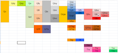
 It is possible to develop a decent correlation diagram in Excel. This is an example of a single worksheet incorporated into a workbook with all of the other tabular data supporting a geologic map that I am making of the Owyhee River area, Oregon. Not only is this a good way to keep all of your data in one place (Arc 9.2 can incorporate Excel worksheets quite painlessly now), but this diagram can be directly linked to an mxd file of the map layout. This is a positive development for all concerned parties (the geology team and the cartography team). This sheet is stored amongst sheets that show the point codes, line codes, and unit codes and can be updated concurrently if you stay on top of it.
Note that there are not nearly as many color options in older versions of Excel. The diagram above was created in the newest version.

No comments:
Post a Comment