Thursday, December 20, 2007

Virtual Globes--Your Destiny or Your Demise?

Last week at AGU, I attended most of the presentations in the Virtual Globe sessions. Some of the presentations were very informative, others less so (what's new?). I had opportunities to talk with some geologists and programmers that are very proficient in presenting their data online in interesting and insightful ways. I also met some of the braniacs from Google and peppered them with all sorts of questions.

What did I come away with? Here's a short list laced with my crass opinions:


1. Exclusively paper geologic maps are dead, dead, dead. They have almost no appeal to anyone other than their authors and a small subset of their colleagues. In the current age, these maps have almost no functional value relative to digital counterparts (which can be printed).

2. Virtual Globes and Geo-browsers are to paper maps and classroom globes like the computer is to the typewriter and calculator. They don't completely supplant them, but come really close.

3. Many of the people that are making the most interesting things are either code-monkeys or are very interested outside observers that have embraced the value of things like Google Earth. Both types expressed some puzzlement to me as to why many scientists are not embracing it in similar ways. There don't appear to be enough active geoscience researchers effectively communicating the value of these tools to other geoscientists and potential end-users of geoscience data. Hopefully this is changing. Millions and millions of people use Google Earth, Google Maps, and related things. Talk about a true outreach opportunity.

4. The archaic evaluation and peer-review system in geoscience / science in general does not adequately accommodate or appreciate the use of these types of tools. This is obviously a major anti-incentive to those slaving away to measure up in traditional pub. counts.

5. There are many really cool ways to share, display, interpret, and explain geologic data using virtual globes that are almost impossible any other way. Check out, for example:


It is like a dream come true for geologists who, appropriately enough, study the freaking Earth!! Accept your destiny or expect your obsolescence.

This short list (screed?) and is not particularly eloquent. For a considerably more thoughtful presentation on a similar theme, check out the following editorial from one of this month's issues of Nature:

Editorial

Nature 450, 761 (6 December 2007) | doi:10.1038/450761a; Published online 5 December 2007

Patching together a world view

Data sets encapsulating the behaviour of the Earth system are one of the greatest technological achievements of our age — and one of the most deserving of future investment.

Technology can change the way we see the world. If the artist David Hockney is to be believed, the camera obscura changed the way artists drew things, and thus how their audiences saw them. Centuries later, photographic film changed the visual arts again, as painters sought to recapture subjectivity in fresh impressionisms and expressionisms in response to the new technology. Then cine-matography brought with it a new mastery over time. Compressed, it turned buds to blooms in seconds — reversed, it re-erected falling chimneys with pleasing symbolic power. These tricks became embedded in our minds, letting us think of time moving backwards and forwards, faster and slower with an educated ease previously absent from the imagination.

In the past two decades, the computer has changed things yet again, introducing an almost infinite capacity to bring what was previously non-visual to the eye, and an almost infinite range of points of view impossible to reach in any other way. The ability to change point-of-view and depth-of-field massively and arbitrarily has created a peculiarly contemporary way of seeing, which American technology writer Steven Johnson has called "the long zoom". This is when a camera focused on, say, a human eye appears to hurtle pell-mell through the pupil to the nucleus of a cell — or pulls back from the orbit of the eye to an orbit round the planet.

In the world of the long zoom, the planetary scale has a particular significance. It links every image of the world to the great image of Earth that contains them all. It builds on and subverts the change first introduced by space flight almost 50 years ago — the ability to stand outside what was previously seen only from within. The long zoom integrates the inside and the outside, giving computers a means of marshalling vast data sets — as users of Google Earth can testify. Geospatial imagery becomes a great uniter of data; whether the data come from satellites looking down, or sensors deep in the oceans, or tracking systems strapped to walruses or gas monitors sitting above forest canopies, computers can, in principle, put them all together (see articles starting on page 778). This is why seemingly arcane developments such as the European Union's INSPIRE directive, a measure that tidies up access to geodata and provides an Internet portal for accessing them, are important. They set the standards by which the world can be freely reassembled.

The long view

The creation of these new ways of seeing the world would be a significant aesthetic achievement even if they had no commercial, scientific or strategic use. In fact they have all three — as well as an even greater environmental usefulness. After the expansion of human population, intensive agriculture and industrial development that marked the twentieth century, it is only with the help of global monitoring systems that today's arrangements of everything from urbanization to epidemiology can be properly understood.

One of the most profound contributions to this approach came from the late David Keeling, a pioneer of climate research who was the first person reliably to measure carbon dioxide levels at remote locations such as Mauna Kea in Hawaii or the South Pole, in what his friend and boss Roger Revelle famously called mankind's "great experiment" with the planet's climate. Keeling's simple instruments became the basis of a network around the world for monitoring trace gases. At various times it was suggested to Keeling that he should perhaps desist from taking such endless care over a single data stream — that this wasn't the basis of great science. It took courage and conviction to keep going — and even now, his heirs struggle to continue the work in the face of unwilling funders and apathetic peers (see page 789).

Ideas not followed through can be taken up again later. A record not made is gone for good.

Now or never

Monitoring the Earth system requires great expertise, not just to build the instruments but to use them properly and interpret their output. Many scientists are, however, far from enthused by projects that do not involve the forming and testing of hypotheses. At worst, monitoring is traduced as stamp collecting and looked down on as drudgery.

Such attitudes must not be allowed to prevail. Testing hypotheses about how the world works requires not just information on the current state of the three-dimensional globe, but on its progress through the fourth dimension of time. Data on the colour of the seas that are not gathered today can never be gathered in the future — gaps left in the record cannot be filled (see page 782). And continuous data sets are going to be vital to the validation of the ever more informative models of the Earth system that we need.

This is why operational systems for data collection in which scientists play key roles are so important. Only they can give us multiscale and multifactor ways of seeing the world that are up to the challenges of the twenty-first century. When the expenditure needed to maintain these data flows conflicts with the funds needed to support fresh scientific research, researchers must acknowledge that there is a strong case for preferring continuous, operational monitoring. An accurate and reliable record of what is going on can trump any particular strategy for trying to understand it.

There is only one Earth, with only one history, and we get only one chance to record it. Ideas not followed through can be taken up again later. A record not made is gone for good. Long zooms in and out of our ever more detailed images of Earth will delight and inform us for years to come. But no digital trickery can replace the steady, fateful pan from past to future.

Sunday, December 16, 2007

Convenient and Powerful Raster to Vector Site

Visit: http://vectormagic.stanford.edu/ for quick conversions of Rasters to Vectors. The results are surprisingly good. Below is an example from the Owyhee River:

Original Photo:


Vectorized Result (click image to expand):

Tuesday, December 11, 2007

Can you write your name with a mouse? (hint: no)


Digital geologic mapping has many advantages over 'analog' mapping. A really big one that is often ignored is the utility of a desktop digitizing tablet. Clicking away with the mouse along an elaborately shaped contact trace is bad for your wrist (and possibly, your brain) and falls far short of the speed and accuracy of using a pen. Just try writing your name in script with a mouse if you don't believe me. Most of us have been using writing implements in our hands since we were toddlers. I use a Wacom Intuos Tablet at home and at the office and can't imagine doing it any other way. You can program buttons on the pen and on the tablet to perform common program tasks to un-tether yourself from the mouse and the keyboard.

On the road and in the field I use a Tablet style notebook PC which allows you to use the pen directly on the screen.

A far better option for office use is a Pen Display:


This would be an extremely useful addition to any GIS / mapping oriented enterprise, no?

For the times when you just need paper but want to stay digital, there is a way. ADAPX has developed a digital pen and digital paper product that is rugged for the field. Check out the website: http://www.adapx.com/

Below is a snippet from their website (looks promising):

More Power to Paper with Digital Data Collection

Using Capturx for ArcGIS, you get fully digitized GIS data from paper maps automatically. Because you don’t have to change the way you work, you eliminate the need for additional training on data collection, importing, and editing processes.

Capturx for ArcGIS is a powerful, easy-to-use, digital data collection solution that enables you to keep using paper maps. If you use ESRI ArcGIS® 9.2, the Capturx for ArcGIS extension is the ideal way to create, import, edit, share, and act on paper-based data in and between geographic information systems (GIS).

Capturx for ArcGIS 9.2 enables you to print out any ArcGIS map and feature legend on digital paper, and then make changes and annotations to the map in ArcGIS by simply writing on the printed map.

There is no need to modify your existing ESRI products because Capturx for ArcGIS can be used with any ArcGIS Desktop licenses, including ArcView®, ArcEditor™, or ArcInfo®, and is compatible with geodatabase feature classes, such as personal and enterprise ArcSDE®.

Image Download the datasheet for a complete list of key features.

Sunday, December 9, 2007

Making Polygons, 101

This is a huge topic for geologists using Arc software. Here are some basic tips (many more will be added over time):

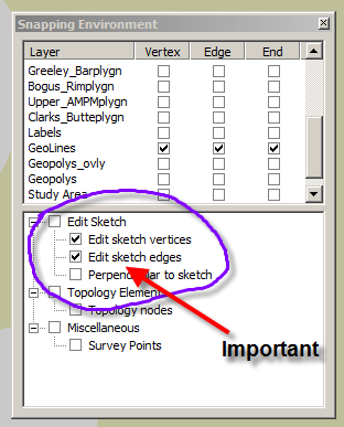
1. Make sure you have 'snapping' on. This is a two-tiered issue. Most importantly, make sure that you have two options selected in the 'Edit sketch' window. This will ensure that your draft (sketch) lines will snap. This is particularly relevant for sketching closed features.


2. Build topology for the geolines layer. This is simple. The most basic need is to enforce the 'no dangles' rule. This will flag sites where your lines overshoot or undershoot. Undershooting lines will not build polygons. Overshooting lines are unnecessary.

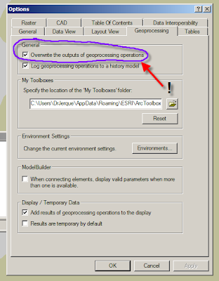
3. If you use ArcInfo, be sure to select the 'overwrite geoprocessing operations' option in the 'Options' menu. Doing this allows you to build polygons repeatedly into the same polygon layer, thus keeping only one layer and also retaining the layer's graphic attributes (i.e. colors and patterns. Note: In ArcEditor, you can only build polygons in ArcCatalog and you cannot build into an existing polygon layer as previously described.

Friday, November 30, 2007

Virtual Globe Sessions at AGU

If you are going to AGU this year, you may want to take a look into the current state of displaying geologic data by attending the sessions on virtual globes:

http://conferences.images.alaska.edu/agu/2007/schedulesess2.html

I will be there and will post anything I learn that is particularly relevant to geologic mapping.

Thursday, November 29, 2007

Exhibit on the History of Cartography

Check out this really cool site of the map exhibit at the Field Museum in Chicago:


Wednesday, November 28, 2007

Correlation Diagram In Excel--it works(!)

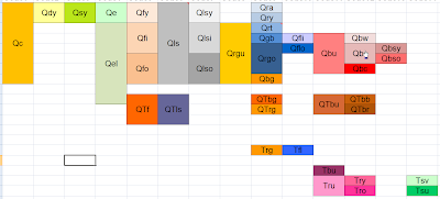
It is possible to develop a decent correlation diagram in Excel. This is an example of a single worksheet incorporated into a workbook with all of the other tabular data supporting a geologic map that I am making of the Owyhee River area, Oregon. Not only is this a good way to keep all of your data in one place (Arc 9.2 can incorporate Excel worksheets quite painlessly now), but this diagram can be directly linked to an mxd file of the map layout. This is a positive development for all concerned parties (the geology team and the cartography team). This sheet is stored amongst sheets that show the point codes, line codes, and unit codes and can be updated concurrently if you stay on top of it.

Note that there are not nearly as many color options in older versions of Excel. The diagram above was created in the newest version.

Collaborative Mapping in Google Maps

Google Maps has just introduced 2 useful things. The first is collaborative mapping in which you can jointly edit the same map with a selected group of users. The second is a kml import tool which allows you to import and export data to and from Google Earth. Sometimes Google Maps is a better option when you want to share a map widely and are mainly focused on point-data. I have been using it extensively for developing topical maps which highlight key geologic and scenic aspects of my study areas.

Note that the map below, though workable in the confines of the blog, is better viewed as a larger map (click the 'view larger map' at the bottom left).


View Larger Map

Sunday, November 11, 2007

Thursday, November 8, 2007

Google Map Example: Bouse Formation outcrops

This map includes locations and photos of key outcroppings of the Bouse Formation in southern Nevada, western Arizona, and southeastern California. Eventually it will be enhanced to include elevations, basic strat context and Sr chemistry where appropriate. I quickly put this together to reinforce the obviousness of using a virtual globe / map interface to evaluate this type of information.

Be sure to zoom in and view in sat or hyb mode. Note that a 'kml' file can be exported to view in Google Earth.


View Larger Map

Data Points in a Geodatabase

Stations (site specific data)

[kind] O = generic observation

[kind] A = age

[kind] G = graphic data

[kind] R = sample sites

[kind] Y = analytical


Age categories (prefix 1)

a = Argon-Argon

r = radiocarbon

t = tephrochronologic

c = cosmogenic
Graphic data categories

p = photograph

s = sketch
Sample site categories

r = rock


s = sediment

t = tephra

Analytical categories


f = fluvial transport direction

g = fluvial gravel lag

This is the structure of point data that we have built into the geodatabase for the Owyhee River mapping project. It covers all of the ground that is presently relevant to that project, but would need to be modified for a bedrock / structural map, for example.

Monday, October 29, 2007

Geologic Line Standards

OK, this is a long one, but I wanted to illustrate a geodatabase coding scheme for various line types used in geologic mapping with ArcGIS. This rather large subset and the related explanations is drawn from my mapping project on the Owyhee River so it is somewhat specific.

The codes are based on terminology in the new digital geologic map standards published by the FGDC. The underlying scheme is based on one developed by Hastings and Sylvester. The seemingly overly detailed list is based on degrees of certainty relative to two aspects of lines on a geologic map: 1. What sort of line it is and how certain you are about that; and 2. How well the line's location is known.

Each funny looking code is a combination of the following characters that account for a variety of lines and a variety of degrees of certainty about what and where they are:

Line Types [kind]
  • C Contact
  • X Fault
  • R Rock body (marker bed or key bed)
  • Z Scarp (as feature, not contact)
  • M Morphologic
  • B Boundary
Prefixes [category]
  • g generic
  • l landslide
  • i internal
  • f fluvial
  • v volcanic
  • s sedimentary
  • z scarp
  • d depression
  • m morphologic feature
Suffixes [location]
  • c certain
  • q questionable
  • a accurate
  • x approximate
  • c concealed
  • i inferred
Code followed by Name
  • uB Boundary—undifferentiated
  • mB Boundary—mapsheet
  • pB Boundary—property
  • sB Boundary—scratch
  • wB Boundary—water
  • eB Boundary—exclusion
  • gCca Contact—Identity and existence certain, location accurate
  • gCqa Contact—Identity or existence questionable, location accurate
  • gCcx Contact—Identity and existence certain, location approximate
  • gCqx Contact—Identity or existence questionable, location approximate
  • gCci Contact—Identity and existence certain, location inferred
  • gCqi Contact—Identity or existence questionable, location inferred
  • iCca Internal contact—Identity and existence certain, location accurate
  • iCqa Internal contact—Identity or existence questionable, location accurate
  • iCcx Internal contact—Identity and existence certain, location approximate
  • iCqx Internal contact—Identity or existence questionable, location approximate
  • sCca Incised-scarp sedimentary contact—Identity and existence certain, location accurate.
  • sCqa Incised-scarp sedimentary contact—Identity or existence questionable, location accurate.
  • sCcx Incised-scarp sedimentary contact—Identity and existence certain, location approximate.
  • sCqx Incised-scarp sedimentary contact—Identity or existence questionable, location approx.
  • ldCca Sag-pond or closed depression on landslide (mapped to scale)
  • viCca Contact separating individual lava flows within same map unit—Identity and existence certain, location accurate
  • viCcx Contact separating individual lava flows within same map unit—Identity and existence certain, location approximate
  • viCqx Contact separating individual lava flows within same map unit—Identity or existence questionable, location approximate
  • gXca Fault (generic; vertical, subvertical, or high-angle; or unknown or unspecified orientation or sense of slip)—Identity and existence certain, location accurate
  • gXqa Fault (generic; vertical, subvertical, or high-angle; or unknown or unspecified orientation or sense of slip)—Identity or existence questionable, location accurate
  • gXqx Fault (generic; vertical, subvertical, or high-angle; or unknown or unspecified orientation or sense of slip)—Identity or existence questionable, location approximate
  • gXcc Fault (generic; vertical, subvertical, or high-angle; or unknown or unspecified orientation or sense of slip)—Identity and existence certain, location concealed
  • kRca Key bed—Identity and existence certain, location accurate
  • kRcx Key bed—Identity and existence certain, location approximate
  • fZca Fluvial terrace scarp—Identity and existence certain, location accurate. Hachures point down scarp
  • fZqa Fluvial terrace scarp—Identity or existence questionable, location accurate. Hachures point down scarp
  • fZcx Fluvial terrace scarp—Identity and existence certain, location approximate. Hachures point downscarp
  • lZca Head or main scarp of landslide—Active, sharp, distinct, and accurately located. Hachures point down scarp
  • lZcx Head or main scarp of landslide—Inactive, subdued, indistinct, and (or) approximately located. Hachures point down scarp
  • liZca Internal or minor scarp in landslide—Active, sharp,distinct, and accurately located. Hachures point down scarp
  • liZcx Internal or minor scarp in landslide—Inactive, subdued, indistinct, and (or) approximately located. Hachures point down scarp
  • vMca Flow lobe or lava-flow front—Identity and existence certain, location accurate. Hachures on side of overlying younger flow
  • vMqa Flow lobe or lava-flow front—Identity or existence questionable, location accurate. Hachures on side of overlying younger flow
  • vMcx Flow lobe or lava-flow front—Identity and existence certain, location approximate. Hachures on side of overlying younger flow
  • vMqa Flow lobe or lava-flow front—Identity or existence questionable, location approximate. Hachures onside of overlying younger flow
  • vMm Crest line of pressure ridge or tumulus on lava flow

Sunday, October 28, 2007

Mandatory (Basic) Image Enhancements

Smooth Your Image:


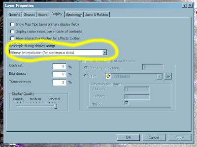
To get the most most out of your base imagery, you need to experiment with different image enhancement tools in Arc. The basic manipulations can be found under the 'display' and 'symbology' tabs found under 'layer--properties' (right-click on the layer of interest). To smooth the image without any negative effects, choose the 'bilinear interpolation' option and then click 'apply'. This will smooth your image in a visually satisfying way. Other resampling options may result in bothersome artifacts in the typical types of imagery that geologists use for mapping.

Stretch Your Imagery:

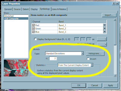
Stretching your image can create levels of contrast and color balance that you will appreciate. For details, consult a remote sensing textbook. For now, just accept the fact that you can vastly improve an image's appearance by applying a standard deviation stretch to your data. Start with n=2 and experiment with increasing and decreasing this value. Also, if you limit the stretch statistics to the 'Current Display Exent' you will get ~local results that typically improve the contrast of the image. This will vary with the absolute range of values present in the current display. Experiment with other stretches.

Both of these enhancements are useful for b/w DOQQs, color DOQQS, and Quickbird data among (presumably) all other remotely sensed base (photo-like) imagery. It is not useful for DRGs.

Geologic Mapping Toolbar in ArcGIS

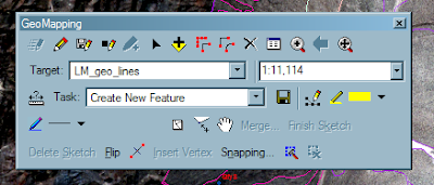
If you are limited to working with one screen, you will find it useful to make a custom toolbar to assist in compiling a geologic map. Simply right-click on the toolbar area and scroll through the list of available toolbars to the word 'customize', then make and name a new toolbar. You can then drag individual tools (commands) from the long lists of possibilities onto your new toolbar. In some cases, you will find that you have to drag the tool from an existing bar on your screen. The scale tool is an example that comes immediately to mind. The shot above is from my laptop.

Thursday, October 25, 2007

Geologic Time and Symbol Standards

It may interest you that there is a newly minted geologic time scale and implied color scheme recently released by the USGS and the AASG:

http://pubs.usgs.gov/fs/2007/3015/

Also note that there is a comprehensive document outlining a digital cartographic standard for geologic map symbolization:

http://ngmdb.usgs.gov/fgdc_gds/

At NBMG and other agencies, the implied color scheme in the timescale is largely unworkable in detailed maps of Tertiary and Quaternary deposits.

As for the symbology, this is an obvious standard for all geologic mappers and agencies to adopt.